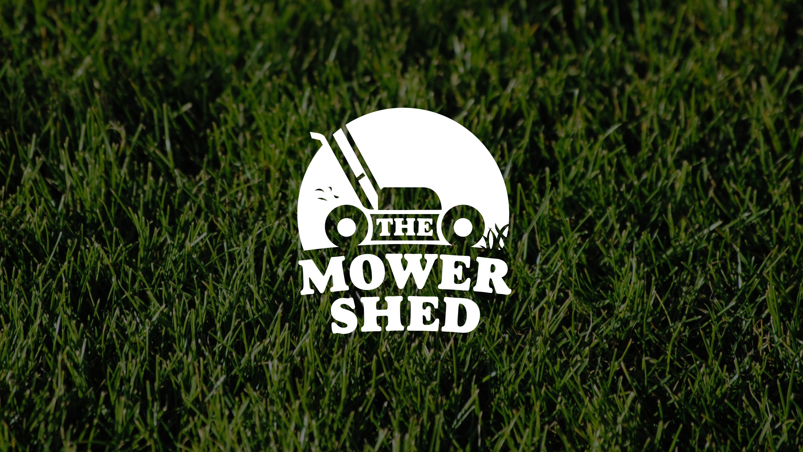
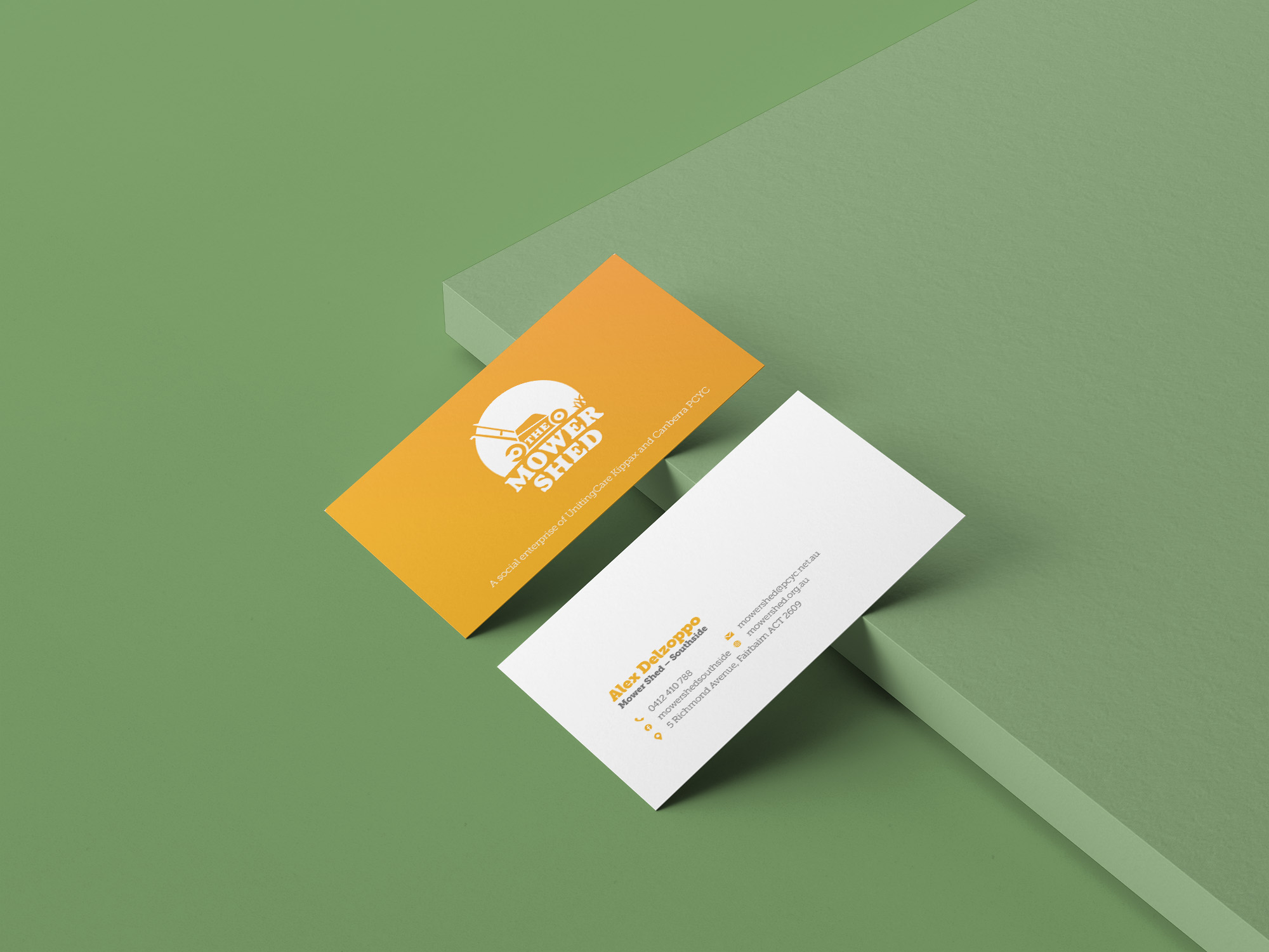
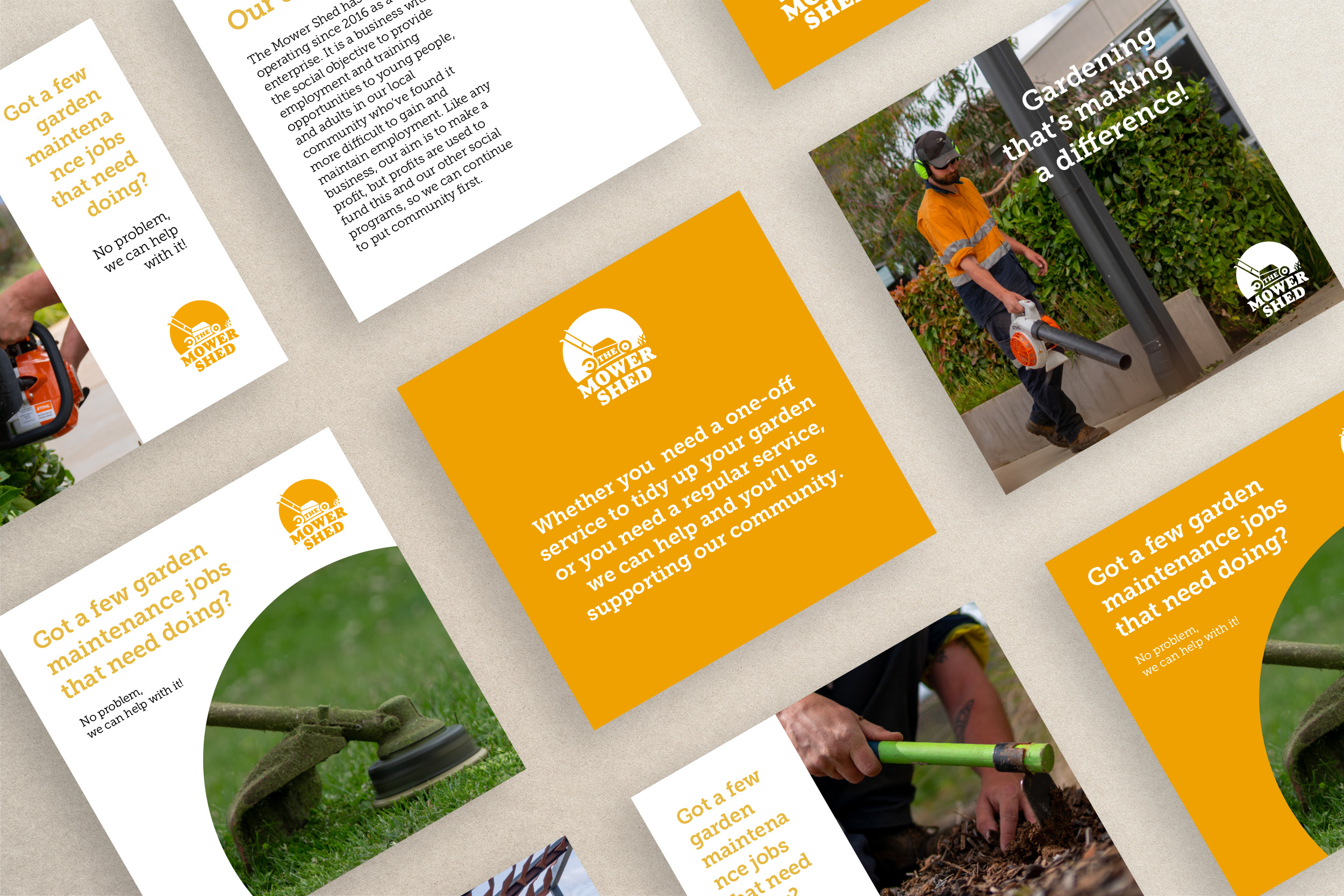
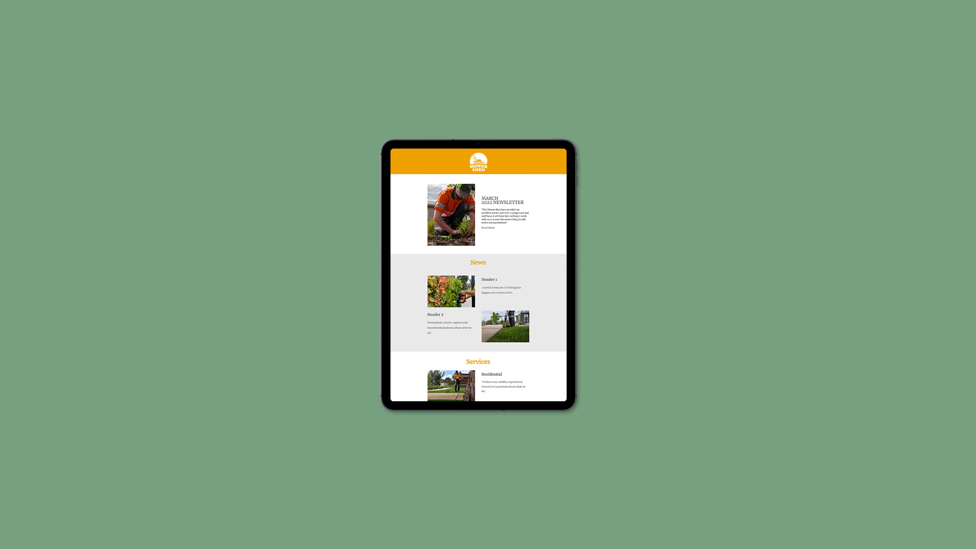
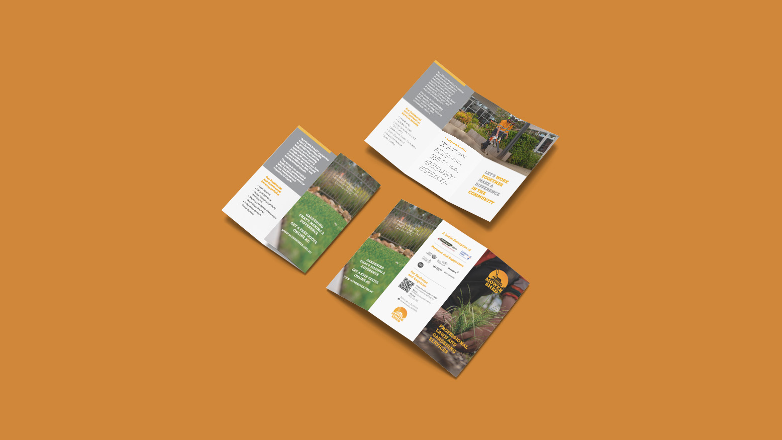
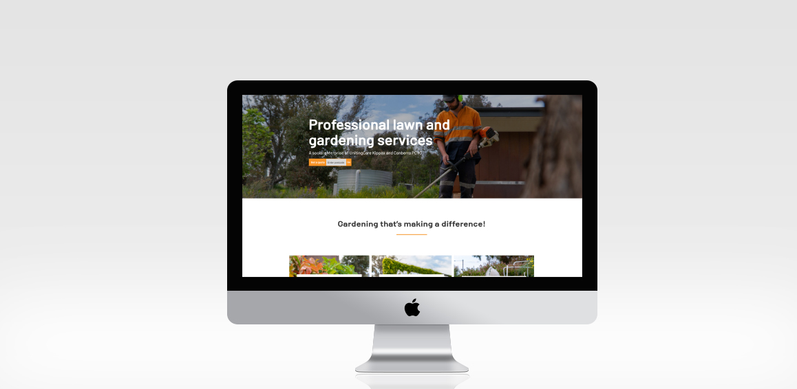
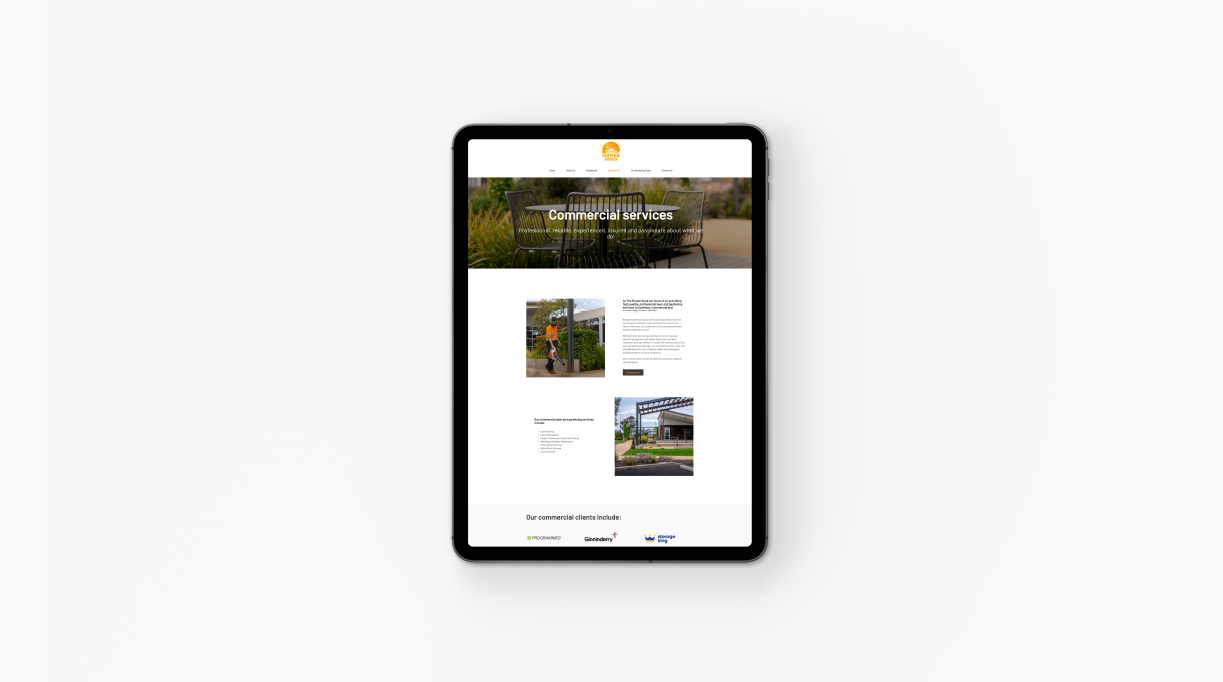
Canberra Relief Network

Canberra Relief Network was established in response to the community’s increasing demand for food and non-perishable essential items following the COVID-19 pandemic. We are very proud that we got the opportunity to work with them to create a brand that reflects the core purpose of CRN. 

We created supporting stationery items as well as the website design and development.

Share

Back to Our Work

Related Projects

Continue reading

KnifeCare

KnifeCare ison online knife sharpening company that needed an entire branding suite and website design to launch their brand.

Custom illustrations and animations help showcase KnifeCare’s services, while an easy to navigate website and minimal stationery design allow for ease of use.

  • Brand
  • Graphic design
  • Stationery including business cards, letterhead, envelopes, and knife sheath
  • Gif animation
  • Custom illustrations
  • Custom designed website that was built in Shopify

Share

Back to Our Work

Related Projects

Continue reading

Qirx

Qirx is an IT company providing out of the ordinary IT solutions. For this logo refresh we wanted to keep the individuality of the Qirx brand but add a fresh twist.

With a new custom word mark, pops of red and strong angles we were really happy with the result.

Share

Back to Our Work

Related Projects

Continue reading

The Oaks Ranch

The Oaks Ranch is a hotel located at Mossy Point on the south coast of NSW. For this project, the aim was to create a new identity in line with a new proposal and structure of the hotel. The identity had retro references and the colour red was used to refer to the magnificent sunset.

We developed a comprehensive brand strategy and identify, supporting brand guidelines and systems, signage and wayfinding, website design and content. We also applied the brand to stationery and uniforms. 

Share

Back to Our Work

Related Projects

Continue reading

Frankies at Forde

Frankies at Forde was named after the shortest-serving Australian Prime Minister (from 6 to 13 July 1945). The logo was designed to have a vintage feel with the use of the iconic fedora.

The pre-launch campaign promoted Frankies serving 8 days, a pun referring to the term Frank served in office.

Signage and a website accompanied the logo design. We liaised with interior designers and signwriters to ensure retro brand implementation. The website was designed by Even Dots and developed in Joomla by 23 Creative.

Share

Back to Our Work

Related Projects

Continue reading

  • 1
  • 2

DESIGN.
PRINT.
WEB.

contact us

Follow us

© Even Dots Creative. All rights reserved.